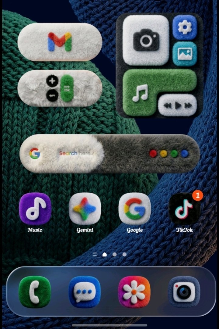
I like consistency more than the actual style usually. The notification badge on the tiktok icon bothers me the most here, it should be fluffy as well
That was my biggest issue with the style of win8 and 10, chaotic. With win11 is finally mostly consistent… But I use linux and gnome now, but it’s annyoing if an app is qt, not gtk, and the chaos comes back again.
Why don’t we have more stuff with character and personality?
It’s extremely easy for 10 members of a design team to sprint together a minimalist design on Canva on their MacBooks whilst using the rest of the quarterly budget on a third monitor for each member than it is to create designs that have textures, realistic materials, etc, and scale well on all screens and so on.

You know what? Actually yes. This looks awesome.
I like consistency more than the actual style usually. The notification badge on the tiktok icon bothers me the most here, it should be fluffy as well
That was my biggest issue with the style of win8 and 10, chaotic. With win11 is finally mostly consistent… But I use linux and gnome now, but it’s annyoing if an app is qt, not gtk, and the chaos comes back again.
You could take a look at https://wiki.archlinux.org/title/Uniform_look_for_Qt_and_GTK_applications#Qt_ports_of_GTK_themes
I just like the fact that it has some character and personality. Why don’t we have more stuff with character and personality?
It’s extremely easy for 10 members of a design team to sprint together a minimalist design on Canva on their MacBooks whilst using the rest of the quarterly budget on a third monitor for each member than it is to create designs that have textures, realistic materials, etc, and scale well on all screens and so on.