

Screenshots of the UI changes on the Mac - in my opinion it is now just wasting a lot of screen estate for zero benefit.
On non-Macs they’re adding an extra usability issue by hiding the top menu bar. I’ve gove back to 2.7.4 for now - fortunately I had my configuration in git.
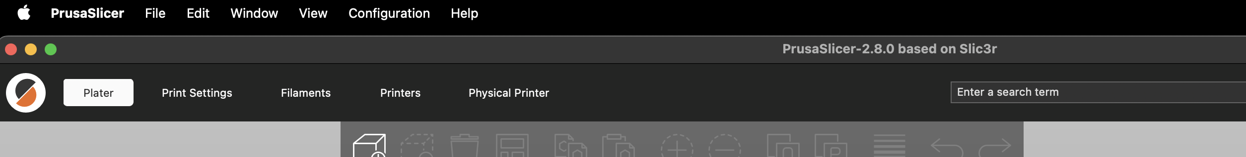
Up to 2.7.4:

2.8.4:
deleted by creator
Gnome 3’s guiding philosophy
And CLion’s new UI… and Cura slicer… and discord with default settings… and most websites… it seems to be a cornerstone of “modern” UI design, and personally I hate it too.