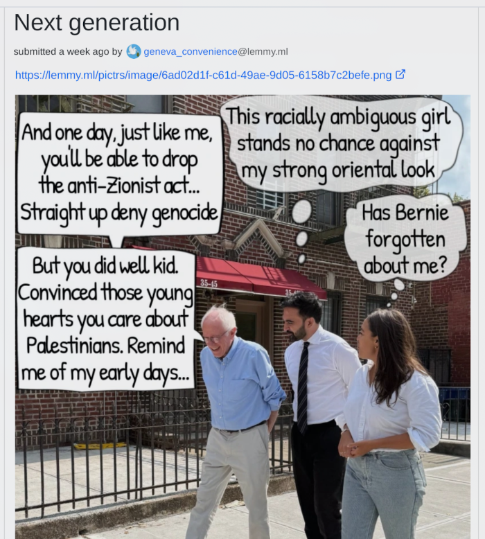
So the thing that brought me back to this to post it is this: Look at the production value on this meme. Speech bubbles drawn with a tablet, partial transparency, professional font but well-chosen so that it can be clear and readable but still condensed to take up minimal space. Look at the composition. Someone sat down with a tablet and made this up, and this wasn’t their first time doing graphic design.
@geneva_convenience@lemmy.ml Where did you find this meme? I am curious now
Edit: Also. You know what isn’t professional about it? The English grammar. “Remind me” and “oriental” aren’t phrasings that I think a native speaker would choose. Why is that part sloppy, when everything else is incredibly painstakingly polished? “Oriental” could maybe be a deliberately weird / wrong word choice as an offbeat joke, I guess, but why “remind me” instead of “reminds me” which is clearly what was intended?
It’s a stupid meme even in context, because it’s literally in response to Mamdani calling out the genocide using that word. And frankly considering we’re talking about a guy in the running to be mayor of a city, not any sort of position with foreign policy power or even power to regulate the industries profiting from this, I’m not sure what more you can ask for.
This guy: YEAH WHAT A FUCKIN ZIONIST TOOL FUCK THAT GUY
I didn’t think it was possible to get worse than shitting on Bernie thinking he is pro-Israel, but apparently it is. This fuckin’ guy should be studied.
Looks like the user that used the image in that thread had previously retweeted it from this thread where at least the context more makes more sense. I did not dig deeper. Scrolling back 19 hours through both of their feeds was enough Twitter for me.
I mean, IDK if it was great expense, but I do think it was done by either someone who decided to make this one fairly dumb point into a true labor of love to make the most polished meme I’ve seen all year for it (unlikely), or by someone who does a ton of graphic design (whether for memes or no) to the point that making stuff that looks polished like this isn’t a big deal for them. The second seems more likely, although I guess who knows.
I am really curious where it came from. Tineye returns 0 results.
true labour of love to make the most polished meme
Making this meme is relatively simple even if you have minimal skills in graphic design (the pitch is IMO also pretty straightforward). The hardest part (on a relative basis) is finding the image.
I think you over-estimate how difficult it would be to make this meme, it’s 5-10 minutes tops if you already have the image.
I am not going to do that. That’s not even a good theme for a meme in this context.
A better one would be that meme image of the grandma by the computer saying something like “those must be the memes my granddaughter was talking about! What polish! They even have transparency!” And then you see the OP meme.
Honestly you don’t have to believe me. I am not a graphic designer, but I regularly make similar stuff for slide decks as highlight for text content.
Complex visualisations (not to mention the actual data analysis, validation etc) takes far more time and effort.
So the thing that brought me back to this to post it is this: Look at the production value on this meme. Speech bubbles drawn with a tablet, partial transparency, professional font but well-chosen so that it can be clear and readable but still condensed to take up minimal space. Look at the composition. Someone sat down with a tablet and made this up, and this wasn’t their first time doing graphic design.
@geneva_convenience@lemmy.ml Where did you find this meme? I am curious now
Edit: Also. You know what isn’t professional about it? The English grammar. “Remind me” and “oriental” aren’t phrasings that I think a native speaker would choose. Why is that part sloppy, when everything else is incredibly painstakingly polished? “Oriental” could maybe be a deliberately weird / wrong word choice as an offbeat joke, I guess, but why “remind me” instead of “reminds me” which is clearly what was intended?
They literally tell you in the post. It was found on this Twitter thread.
It’s a stupid meme even in context, because it’s literally in response to Mamdani calling out the genocide using that word. And frankly considering we’re talking about a guy in the running to be mayor of a city, not any sort of position with foreign policy power or even power to regulate the industries profiting from this, I’m not sure what more you can ask for.
Thanks, this is interesting. Also, holy shit…
https://xcancel.com/orange_wink2/status/1982562697876221992#m
Person: Refuses to join the IDF and goes to jail
This guy: YEAH WHAT A FUCKIN ZIONIST TOOL FUCK THAT GUY
I didn’t think it was possible to get worse than shitting on Bernie thinking he is pro-Israel, but apparently it is. This fuckin’ guy should be studied.
Ok wow, that is absolutely unhinged.
Looks like the user that used the image in that thread had previously retweeted it from this thread where at least the context more makes more sense. I did not dig deeper. Scrolling back 19 hours through both of their feeds was enough Twitter for me.
More memes made or reposted by this guy:
man the antisemitism is ripe
Removed by mod
It’s almost like it was hand crafted at great expense by someone for whom English isn’t their first language.
I mean, IDK if it was great expense, but I do think it was done by either someone who decided to make this one fairly dumb point into a true labor of love to make the most polished meme I’ve seen all year for it (unlikely), or by someone who does a ton of graphic design (whether for memes or no) to the point that making stuff that looks polished like this isn’t a big deal for them. The second seems more likely, although I guess who knows.
I am really curious where it came from. Tineye returns 0 results.
Making this meme is relatively simple even if you have minimal skills in graphic design (the pitch is IMO also pretty straightforward). The hardest part (on a relative basis) is finding the image.
I think you over-estimate how difficult it would be to make this meme, it’s 5-10 minutes tops if you already have the image.
I don’t think the point is the difficulty but the attention to detail
Removed by mod
Sure. Want to make one that has this level of polish, to demonstrate how easy it is? The subject matter can be how PhilipTheBucket is a big dummy.
I am not going to do that. That’s not even a good theme for a meme in this context.
A better one would be that meme image of the grandma by the computer saying something like “those must be the memes my granddaughter was talking about! What polish! They even have transparency!” And then you see the OP meme.
Honestly you don’t have to believe me. I am not a graphic designer, but I regularly make similar stuff for slide decks as highlight for text content.
Complex visualisations (not to mention the actual data analysis, validation etc) takes far more time and effort.
Removed by mod
Removed by mod
Professional? They didn’t even remove the border where the speech bubbles connect.
Literally unreadable
It indicates that the bubbles were probably PNGs lifted from somewhere instead of hand-drawn themself.
It’s an incredibly amateur mistake. It’s someone using a program for comics captioning on a photo. Don’t overthink it.
Is it? Is that why the “thought” bubbles look kind of weird? I mean, yeah I guess it definitely could be… do you know what program?
Removed by mod
Removed by mod
Removed by mod
Holy shit, you really think so? I gotta tell Blinken about that at our next meeting then…
Removed by mod
https://www.youtube.com/watch?v=_jyS5uXQer0&t=25s
What if Putin was on Lemmy
That would be crazy…