I don’t understand this. People have been nostalgic for windows 7 aero for years. I maintained since 7 came out that aero was the best windows UI ever made. It’s so pretty and functional. I run Linux with an aero theme to this day.
Why all of a sudden does everyone hate the glass look? It’s like a switch flipped.
Edit: Ah I get it. It’s not necessarily the glass aesthetic but apple’s implementation along with some of the functionality. I didn’t actually realize this had to do with Apple at all haha.
I don’t dislike aero or glass, I just dislike iOS implementation of it. With the wrong background sometimes you can’t read buttons for example, and a myriad of little things that are insignificant on their own but a pain in numbers.
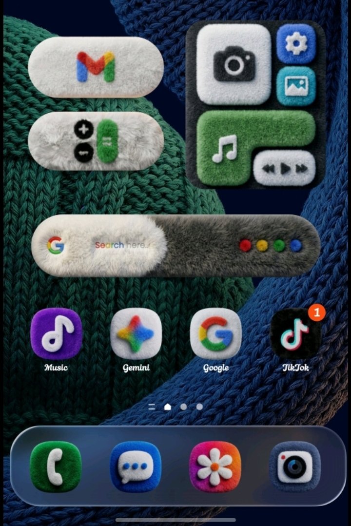
This is with the extra brightness and contrast added by the iOS screenshot functionality during screenshot. I would need a second phone to truly show you the horror of liquid
They focused so much on making it pretty that it ceased to be functional. There should not be animation lag on basic UI elements. My phone is not that old and my screen will freeze up with a big Liquid Glass bubble obscuring the display for at least a full 2 seconds depending on the button I press. They allow per app Liquid Glass settings, which is great considering how terribly it’s been implemented on certain apps, but the fact it’s deemed necessary should be a huge indicator of the overall quality. A nonzero amount of dev time was put into making sure we can reject their design direction and still that doesn’t work. The safari browser implementation of turning off LG leaves empty blocks on the top and bottom of the screen instead of the normal fade away of those elements, and that is their own browser. I imagine a lot will be patched out soon, but the roll out has been a buggy disaster in my opinion. I think it’s really colored people’s opinion on LG in general now.
I’ll join in and say that I also don’t understand the hate. I get the readability and accessibility stuff, but as far as pure aesthetic, I personally really enjoy it. I haven’t run into the supposed complete workflow hitches that others seem to have with it.

I don’t understand this. People have been nostalgic for windows 7 aero for years. I maintained since 7 came out that aero was the best windows UI ever made. It’s so pretty and functional. I run Linux with an aero theme to this day.
Why all of a sudden does everyone hate the glass look? It’s like a switch flipped.
Edit: Ah I get it. It’s not necessarily the glass aesthetic but apple’s implementation along with some of the functionality. I didn’t actually realize this had to do with Apple at all haha.
Windows 7’s Aero was amazing. Liquid Glass is terrible.
I don’t dislike aero or glass, I just dislike iOS implementation of it. With the wrong background sometimes you can’t read buttons for example, and a myriad of little things that are insignificant on their own but a pain in numbers.
This is with the extra brightness and contrast added by the iOS screenshot functionality during screenshot. I would need a second phone to truly show you the horror of liquid
I was never a fan of aero, but I don’t care a lot about UIs in general. It’s just that Liquid Glass as implemented by Apple specifically is terrible. When I first updated to it I was looking for how to tune it down and found this article that covers what I think is the biggest issue with their implementation: https://www.macworld.com/article/2891233/this-liquid-glass-toggle-is-a-window-into-apples-broken-design-process.html
They focused so much on making it pretty that it ceased to be functional. There should not be animation lag on basic UI elements. My phone is not that old and my screen will freeze up with a big Liquid Glass bubble obscuring the display for at least a full 2 seconds depending on the button I press. They allow per app Liquid Glass settings, which is great considering how terribly it’s been implemented on certain apps, but the fact it’s deemed necessary should be a huge indicator of the overall quality. A nonzero amount of dev time was put into making sure we can reject their design direction and still that doesn’t work. The safari browser implementation of turning off LG leaves empty blocks on the top and bottom of the screen instead of the normal fade away of those elements, and that is their own browser. I imagine a lot will be patched out soon, but the roll out has been a buggy disaster in my opinion. I think it’s really colored people’s opinion on LG in general now.
I’ll join in and say that I also don’t understand the hate. I get the readability and accessibility stuff, but as far as pure aesthetic, I personally really enjoy it. I haven’t run into the supposed complete workflow hitches that others seem to have with it.