

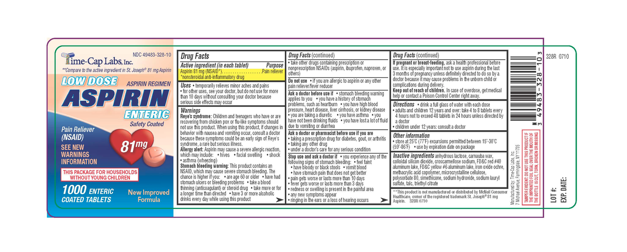
(Generic label used for illustrative purposes)
Instead of having the directions clearly, consistently, and conveniently at the top, it’s expects you to unfurl the damn label like a scroll, read through the tiny print until you get to the directions and dosing information.
I’ve already got a headache. I don’t need to be squinting at this tiny text to try to find the one bit of relevant info I need. I just want my headache to go away for a while.
It’s not just aspirin, ibuprofen, etc. It seems like everything with a label is like this now.
I understand how it might be personally upsetting, but products should have warnings and health guidelines before the instructions. If I’m supposed to wear gloves before touching something, I sure hope I see that before I see how to use it. This is actually good in my opinion. People might not actually read it all, but at least safety information is front loaded.
I don’t disagree, but prioritize to what people need to know in daily use instead of burying the lede in a sea of boilerplate.
I’m old, so I remember product info/safety labels before they turned into this. If you need gloves for something, step 1 was usually “Put on gloves”.
Step 1: what is this and what is used for and what’s not used for.
Step 2: put gloves
Steps 2.1 to 2.n: every single case were gloves are not enough based on age, weight, health factors, other medicament, work…
Step 3: the many things that can go wrong and what to do in any case.
Step n: now you can take it.
Now you have a full prospect.