

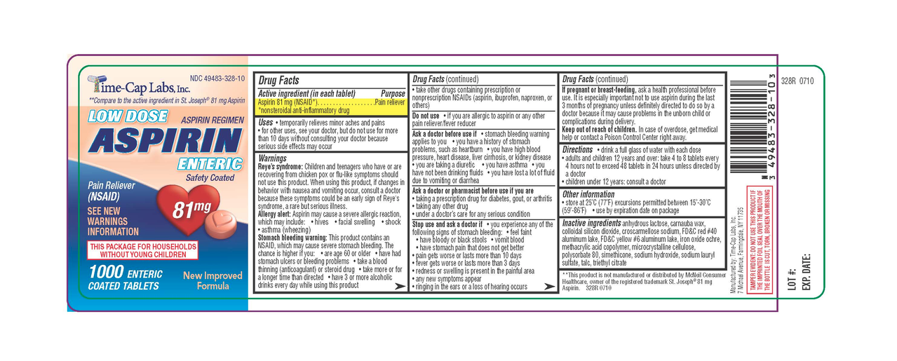
(Generic label used for illustrative purposes)
Instead of having the directions clearly, consistently, and conveniently at the top, it’s expects you to unfurl the damn label like a scroll, read through the tiny print until you get to the directions and dosing information.
I’ve already got a headache. I don’t need to be squinting at this tiny text to try to find the one bit of relevant info I need. I just want my headache to go away for a while.
It’s not just aspirin, ibuprofen, etc. It seems like everything with a label is like this now.
Maybe you’re wired different. I skimmed the whole thing twice, specifically looking for the directions section, knowing how it should look. I missed it the first time…I thought the joke was that there weren’t any directions, or they were hidden on a page 2.
Maybe my ADHD mind?
I definitely get what OP is saying tho. Having an unknown and changing number of warnings, before the directions, in the same typeface as the directions, could make it more dangerous.
Ideally there would be a color-coded label system for different types/severities of warnings, and the direction clearly printed above/near the top. Having all the warnings first didn’t make me read them, just the bolded parts, looking for the directions. Directions are the most looked-for thing, they should be in an obvious place.
This is like the drug companies following supermarket logic, putting the milk in the back corner of the store hoping you impulse a bunch of stuff on the way. But instead tricking the customer into learning something, the customer says “all this science shit is boring and scary sounding” and they go get the raw milk from the farm stand because that doesn’t “need” warnings.
Well, I got ADHD, too. So that probably isn’t what makes the difference.