

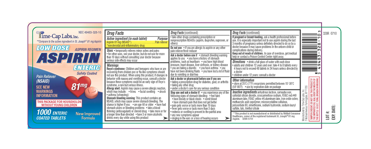
(Generic label used for illustrative purposes)
Instead of having the directions clearly, consistently, and conveniently at the top, it’s expects you to unfurl the damn label like a scroll, read through the tiny print until you get to the directions and dosing information.
I’ve already got a headache. I don’t need to be squinting at this tiny text to try to find the one bit of relevant info I need. I just want my headache to go away for a while.
It’s not just aspirin, ibuprofen, etc. It seems like everything with a label is like this now.
The point is, it would be better for stupid people if the dosing was clearly and immediately labeled without needing more action than just looking at the bottle. I shouldn’t be fiddling with resealable adhesive on the instruction booklet to see “adults: take 2”
you mean like this?
The main issue the OP is saying is how tiny the text is, and that it’s hidden in the middle of a sea of text. You only take medicine when you’re feeling like shit, so having to squint and find information that is vital to your health is a tad annoying. RIP to anyone with dyslexia, poor eyesight, hangover/drunk, etc. trying to read these labels quickly or in pain.
I do get this point; however, if you have trouble finding or reading this info, it is probably unsafe for you to take any medicine without assistance
Have you never had a medicine bottle that you needed to get a fingernail under a tiny tab to unstick some adhesive to get to the dosage? Do you think everyone who doesn’t have fingernails should just have to guess? Do you think everyone with vision impairment should NEED assistance to find the number of fucking Advil to take? Give me a break.
Make it so the directions are clearly visible without extra steps.
Not disagreeing it could be easier but people seriously underestimate the dangers of OTC meds… you can easily fry your liver
Which is why they should be more clearly labeled…
This is not a sea of text. The structure is clearly outlined (literally), with each section stating in bold what it’s about. If you cannot comprehend this, the problem is your reading, or more precisely, your skimming skills.
Idk…I struggle with this too like the OP said. Yes, the directions are there. But notice how that paragraph was hidden within walls and walls of text.
If they put it at the top or at the very least bolded it or made it in a different color or literally anything, it would be way better for everyone and even more idiot proof.
Are we talking about the same picture?
The text is already clearly structured into sections that each have a bold frame visually indicating them along with bold headings for each section.
It took me like a few seconds to skim to the relevant part of the outline clearly labeled “Directions” and I am neither a native speaker nor have I ever seen a label like this before.
Maybe you’re wired different. I skimmed the whole thing twice, specifically looking for the directions section, knowing how it should look. I missed it the first time…I thought the joke was that there weren’t any directions, or they were hidden on a page 2.
Maybe my ADHD mind?
I definitely get what OP is saying tho. Having an unknown and changing number of warnings, before the directions, in the same typeface as the directions, could make it more dangerous.
Ideally there would be a color-coded label system for different types/severities of warnings, and the direction clearly printed above/near the top. Having all the warnings first didn’t make me read them, just the bolded parts, looking for the directions. Directions are the most looked-for thing, they should be in an obvious place.
This is like the drug companies following supermarket logic, putting the milk in the back corner of the store hoping you impulse a bunch of stuff on the way. But instead tricking the customer into learning something, the customer says “all this science shit is boring and scary sounding” and they go get the raw milk from the farm stand because that doesn’t “need” warnings.
Well, I got ADHD, too. So that probably isn’t what makes the difference.
Yes, but CLEARLY VISIBLE WITHOUT EXTRA STEPS. I shouldn’t have to unstick/restick hidden bullshit just to find out how many pills to take. You know like how fire exits need to have single-step door openings?